Sunday 30 September 2012

Crayfish party

I can finally share this awesome news with you – I have been asked to join the design team for Allt om Scrap!!! I feel SO honored!!! Allt om Scrap is a Swedish Web Magazine with a very high standard on both the articles and the designers! (The last magazine had more than 11.000 readers!) The latest number, which was published today is filled with inspiration! It’s written in Swedish but you can get just as inspired just by looking at the pictures! And it’s for free!!! Take a look it here!
I actually managed to squeeze in a layout. It’s a layout on the autumn theme.
I chose to scrap some photos from a ‘kräftskiva’ (a party where we eat crayfish, which is a tradition here in Sweden in august). On these parties it’s a tradition to wear a special kind of (silly) party hats, and of course the girls wanted to make their own.
I wanted the layout to be red, black and white. I have colored the background with PanPastel and spayed with some different Dylusions inks on templates. I filled some of the diamond shapes with a black pen and marked its contours with a white pen. I also used some modeling paste on a template to make some structured flowers. I marked their contours with a black pen. I finally splashed on some acrylic paint. The crayfish embellishments are bought in the grocery store and are the same as the girls used on their party hats. :)

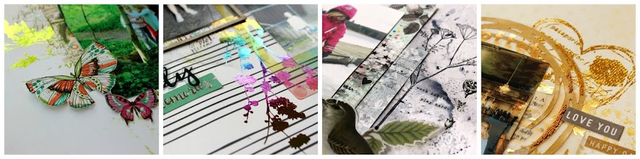
Here’s some close ups:


Thanks for popping by!!! And a special thanks to you girls who wanted me on the team! Now, don’t forget to pop over to Allt om Scrap to read the free magazine!!!

Wednesday 26 September 2012

Midsummer dance

These pictures were taken this summer when we were celebrating midsummer at DD’s kindergarten. The background is partly made by Prima (Firefly Delight) but I added some more paint and other stuff to it. ;) I first used some gesso, and then I continued with mist, modeling paste and acrylic paint. I also did some layering and some doodling.
The dots on the left are made by modeling paste and some punchinella. I messed it up a bit before it dried, sprayed some mist and splashed some acrylic paint on the top.
To make the sun I sprayed on the paper from a short distance and did some doodling. The “frame” on the big picture is just a drawn line.
And I have to show you the picture I used too – DD and DH are so adorable dancing together!

Thanks for looking! Have a nice week!

Saturday 15 September 2012

A creative gun

One period DD liked to play with guns. She didn’t have one so she used a stick or built one with Lego. One day she was with me in our scrapbooking/pottering room and she suddenly started to create a gun using different papers. Quite creative, I think. :)
I thought the Dash Dalton paper from October Afternoon was perfect for these pictures. I cut out two strips and doodled a frame around them. On the background paper I added some Dylusions Ink Spray using a couple of different techniques. I added some texture using modeling paste on a template and filled its contours with a black pen. The film strip is also done with a template using black gesso. I used a white gel-roll pen for its contours.
I love the jeans leaves! They are easy to make – I just doodled on a patterned paper and cut them out. I will definitely do it again!
A comment on the language for my Swedish readers: (Hon brukar kalla gevären för "skjutare" - därav texten till höger. Pistoler kallas för övrigt "pangare"...)

No challenge this time – just loads of fun! Hope you enjoyed looking! Have a nice weekend!!!

Saturday 8 September 2012

Taking a swim at grandma’s place

I have one more DT layout to share this month - The Craft Garden. The challenge is to be inspired by
W A T E R. This is my take:
On the background I worked with gesso on a template and Pan Pastel. I highlighted some circles with mist dripping down the page, a blue pen and Neo Color II. I also splashed on a lot of acrylic paint in different blue colors.
I found a metal anchor in my stash that fitted perfectly. Cute, ha?
Thanks for looking! I hope you are having a great weekend!!

Tuesday 4 September 2012

Doodling at ARTastic

Anyone who likes to doodle? ARTastic continues to present AWESOME challenges and this month it’s all about geometric patterns which could mean some doodling!!! I was so inspired when I saw the inspiration painting, and it was actually the reason I tried zen doodling. This was my first layout using that technique but as it’s a CT layout I haven’t been able to show it until now. Here it is:
Inspiration picture: The prophetic calamity by Shannon Crees (a graffiti artist). The criteria are "black background and solid use of geometric patterns". Jane also writes that "this could be the perfect time to try some doodling".
I was inspired by the sea theme and the colors in the painting. I wanted my doodling to look both as sea plants and waves. The doodling is done with a white gel pen and for the colored parts I used NeoColor II.
Some close-ups:


(There is a fun/cute story I want to tell you too. Do you see the pom poms? I got them as a present from DD on Mother’s Day. It is part of her “scrapbooking stuff” and I thought it was just something she picked without a thought. So I put it back in her stash when she didn’t see it. But she noticed that at once and gave them back to me. And since then she has been asking me every day if I’m not going to use them on a layout... (Mother's Day is in May in Sweden...) So I had to do that! =0 And now I did. :))
So now I want to see you all DOODLE over at ARTastic!!! Thanks for popping by!

Sunday 2 September 2012

Pony riding

This layout was made for a sketch challenge at Veckans Nya Skiss. I was very inspired by the sketch as it was different from what I’m usually doing – and that is always fun!
My original idea was to use a lot of traditional scrapbooking flowers (as for example Prima’s) but I thought it looked too cute so I doodled some flowers instead. They are colored with ProMarkers.

On the background I used Glimmer Mist flowing down the page. To reinforce the green at the top of the page I used both Pan Pastel and acrylic paint. I also splashed some acrylic paint. This is the result:
And here’s a close up:

 Thanks for looking! Have a nice weekend!!

Saturday 1 September 2012

Our favorite place to go

It’s a new month which means new challenges! Kraft It Up! has a color challenge this month – with a color scheme that’s quite different from what I normally use. That’s true for one more of my DT/CT- layouts this month as The Craft Garden wants you to create in blue. (I will show that one here soon.) So it has been a lot of fun for me!
Here’s my take on the Kraft It Up! challenge:
My parents in law have a cottage that we can use when we want to and we all love to go there. There are so many beautiful places in the surroundings and of course I have a lot of pictures that I want to save for the future. So what should I do? A multi photo layout? No, I created an envelope and put four more pictures in there! In this way they will be a bit like a secret…
The envelope is made from scratch and I have used Distress ink, stamp embellishments and some stamps to make it look old and used.
The mushrooms and grass are stamped on Kraft paper and colored with a white gel pen.
The background is decorated with ink on a template, acrylic paint added with different techniques, and some butterfly stamps. The frame is doodled on a patterned paper and cut out.
I hope you want to join in on the challenge! To create on kraft paper is always fun as it makes the colors more visible! If you want some more inspiration you can go here. The CT girls are also linked up in the side bar to the right.
Thanks for looking!!! Have a nice weekend!